

The construction holding needs a solid corporate identity that complies with professional development industry.
Develop a reliable brand identity and adapt it for all needs and occasions.
The usage of a rigid typography with the strict geometricity that represents the scale and the solidity of the brand.
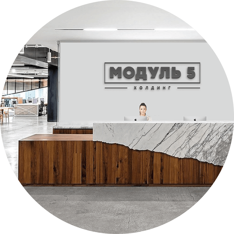
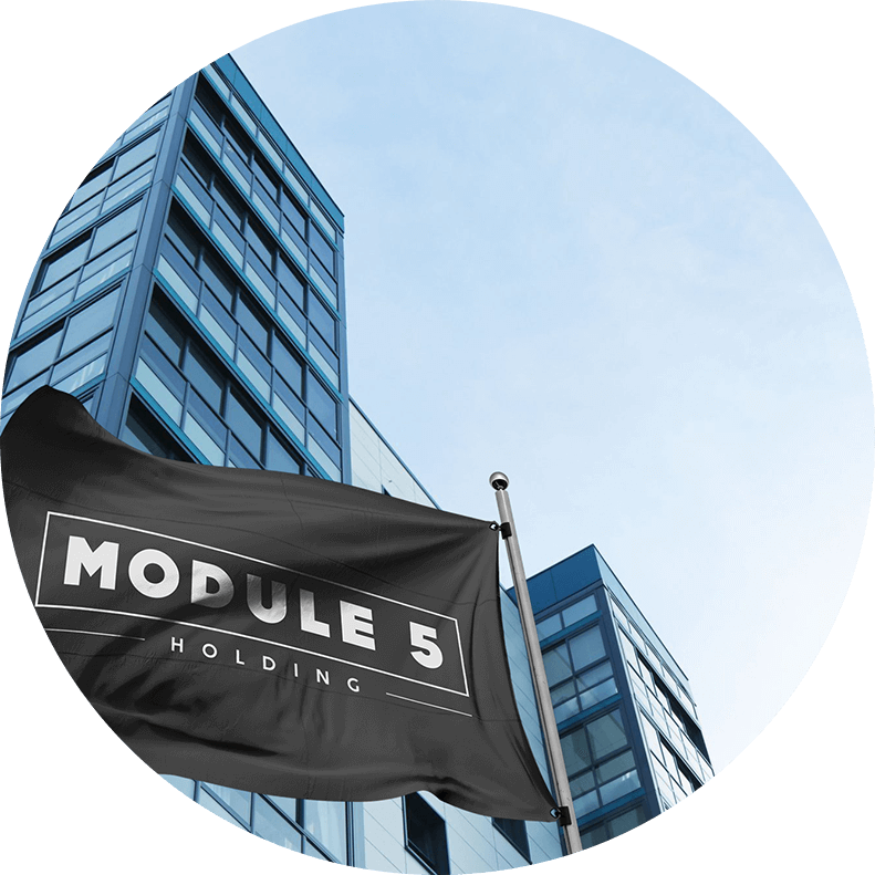
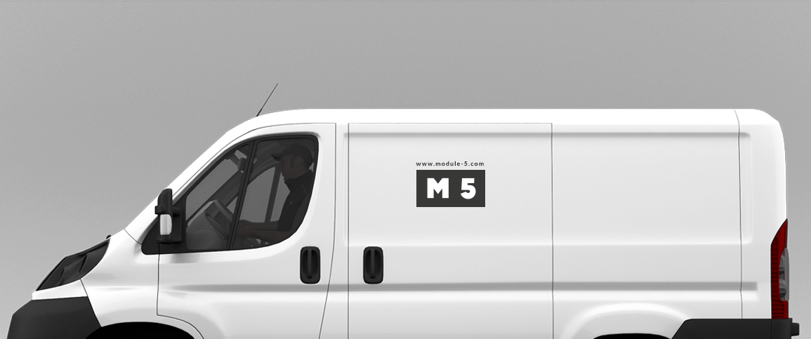
The brand mark of the company that is confident in its capacities and professionalism looks this way:

The logo is so self-sufficient that even its compact form retains the character of the brand:
Compact logo variations identify each of five business units of the company:


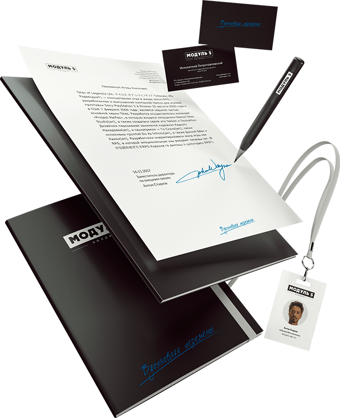
Corporate business cards sustain the concept of geometricity and confident minimalist. They also support the inversion:

The business essence of the corporate identity requires an emotional slogan to make it balanced. The slogan is based on the mission of Module 5 that strives to change everything around the company for the better:
Business documents in operation:
