




TePe opens its representative office in Ukraine. However, the awareness of the brand in the country is low.
TaskBoth the presentation of the products and the overview of the brand require delivering the information as the main goal. A clear and minimalistic design meets the objective efficiently:

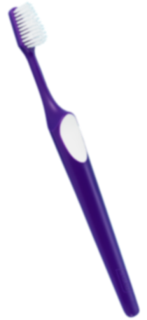
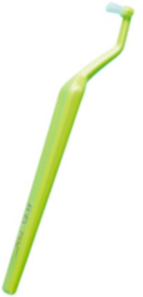
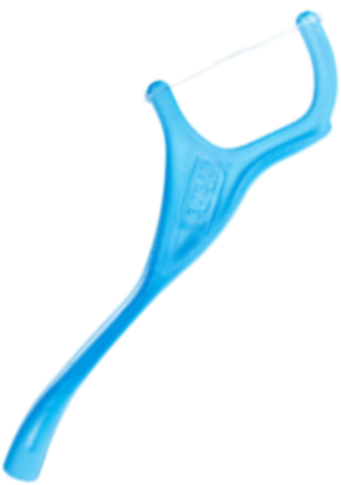
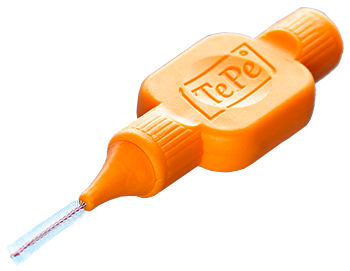
We have taken into account the peculiarities of the products available in the store (all the images appear to be vertical). As a result, we have developed a unique product gallery with an animated preview and quick order function. Users do WANT to click on the products!
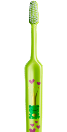
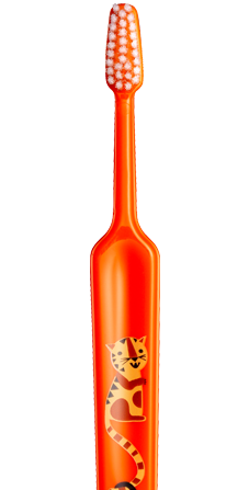
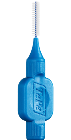
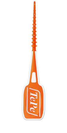
TePe products are not just accessories that are useful but they are very stylish as well. Aiming to emphasize their design we demonstrate each product using big close-up images. People can literally feel the desire to buy it:

TePe products are available in different cities and in different locations, so there is an interactive map where it’s possible to search for points of sales in a user’s location:

This is the way how we acquaint website users with one of the best brands in the world responsible for happy smiles.
:)


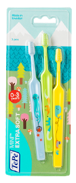


Enjoy your shopping onwww.tepe.com.ua! :-)